Putting together an A+ landing page can be tricky.
There are so many elements that a top-notch landing page needs, and making those elements the “best” they can be often depends on what your landing page goals are.
Take form length, for example. It’s just one of the many components you need to optimize, but best practices will tell you that both short and long forms perform well — it all depends on whether you want to generate a lot of (potentially) lower quality form submissions, or a smaller number of higher quality submissions.
So if you’re looking to up your landing page game, it’s helpful to know what goes into a great landing page and see a few examples of these nuanced elements in action. Surprisingly, when I started doing research into the latter, I realized there are hardly any sites out there with examples of modern, impressive landing pages that are more than just a sign-up form on a homepage. So we decided to compile a list of landing pages we love ourselves.
Big, big caveat here: I don’t have access to any of the stats for these pages, so I can’t tell you how well they convert visitors, leads, and customers. Still, these examples have some of the best combinations of those nuanced landing page elements I’ve ever seen. Obviously, if you feel inspired to try any of these tactics on your own site, the only way to know whether they’ll work for you for sure is by testing them out for yourself.
16 Examples of Great Landing Page Design
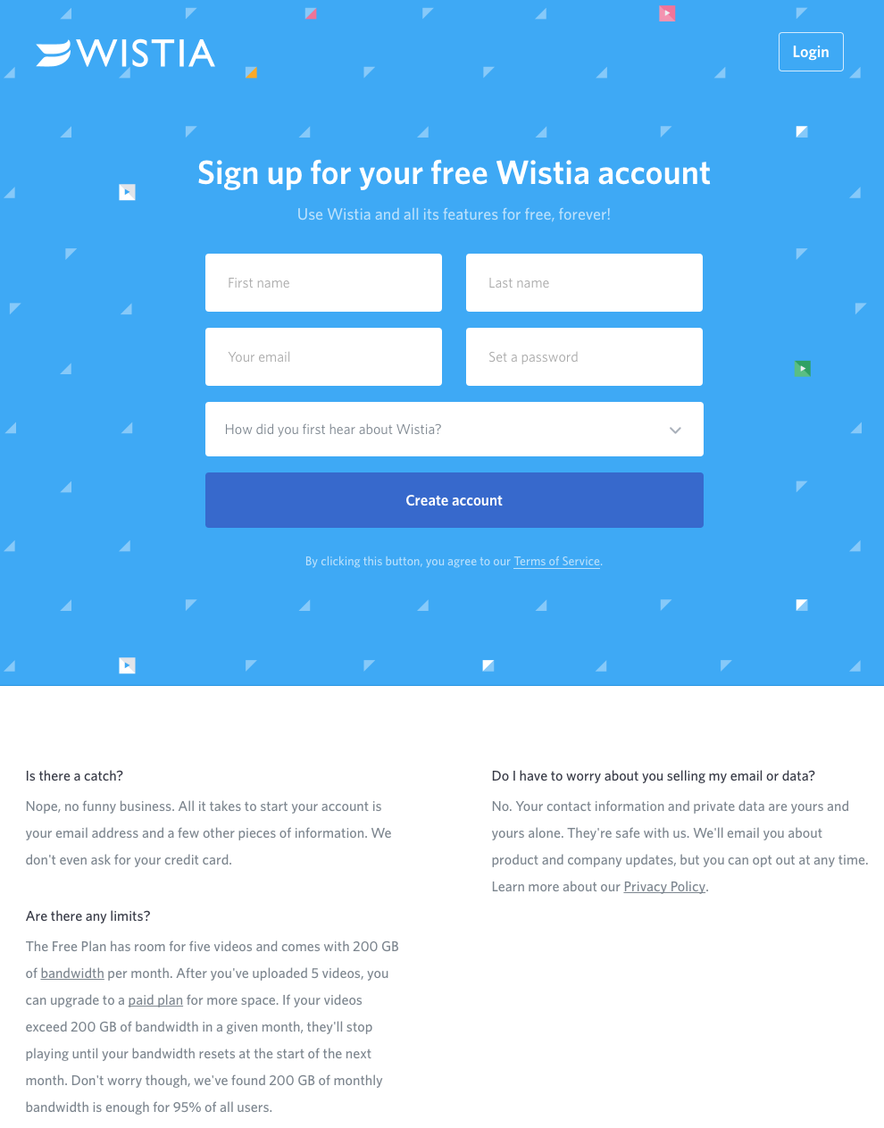
1) Wistia
First up is Wistia’s landing page for their Free Wistia Account. Right off the bat, you notice the one-field form to create your account — the blue, minimally patterned background contrasts nicely with the bright white form field.
The length of the form field combined with the prominent placement eliminates nearly all friction to create an account … but if you’re having doubts, you can always scroll below to read answers to top FAQs. By separating these two sections with stark color contrast, Wistia makes it much easier for you focus on converting.
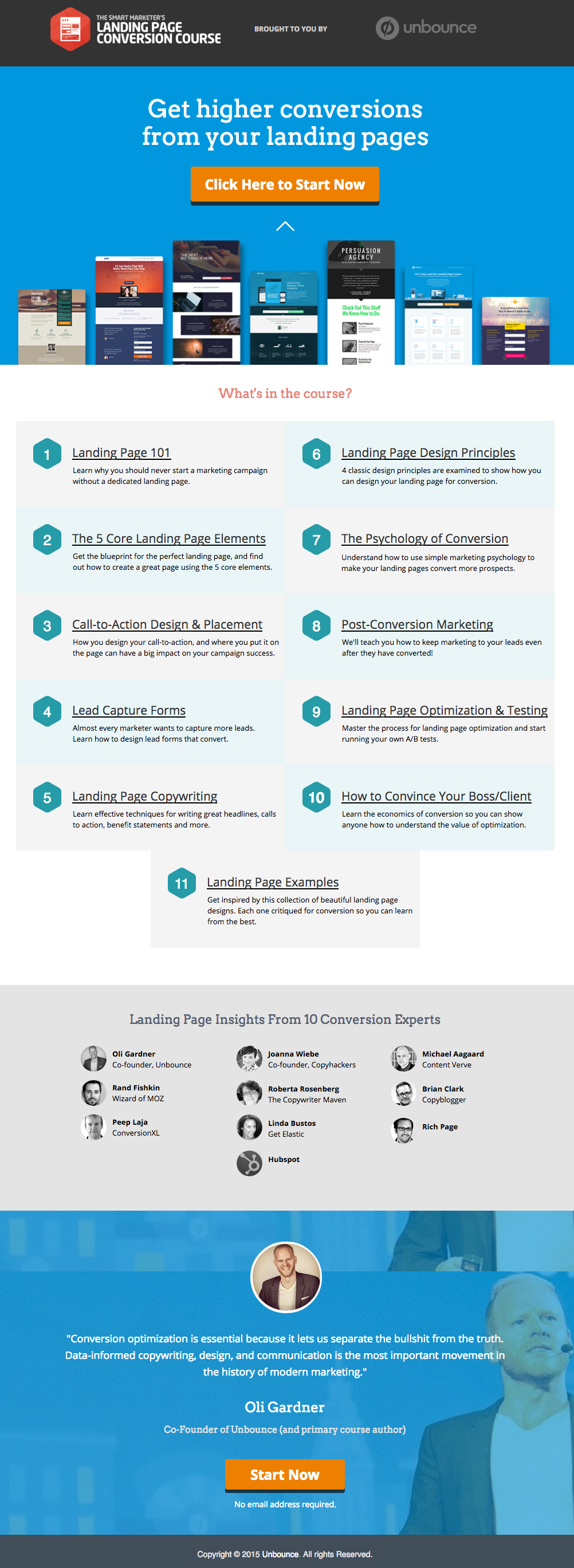
2) Unbounce
It’s no surprise Unbounce is near the top of this list — they’ve actually written the book on creating high-converting landing pages. Although there are lots of amazing things about this landing page, the two that I absolutely love are: 1) The directional cue from the supporting images to the CTA button, and 2) the detailed — but well packaged — information below the form.
The first helps direct attention to the goal of the page — for you to fill out the form — in a way that’s unobtrusive. The second gives this page an SEO boost (search engines will have more content to crawl) and assuages any worry from folks who need to know more about a piece of content before handing over their information, all while not distracting people from the form.
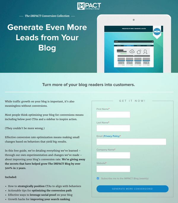
3) IMPACT Branding & Design
Full disclosure: IMPACT is a HubSpot partner — but that’s not why they’re included here. IMPACT’s landing pages have long been a source of design inspiration. I love the simple layout of the page, from the large headline copy and detailed featured image, to the outline that surrounds the form, to the colors and fonts that are very pleasing to the eye.
Notice that they’ve included a check box to subscribe to their blog, which is automatically checked. Note that while adding a check box field to your landing page forms is a great way to increase subscribers, it’s better to leave it unchecked and let users opt in. Otherwise, you’ll risk adding a lot of low quality subscribers to your contact base. (Read this blog post to learn why having low quality subscribers can hurt your business.)
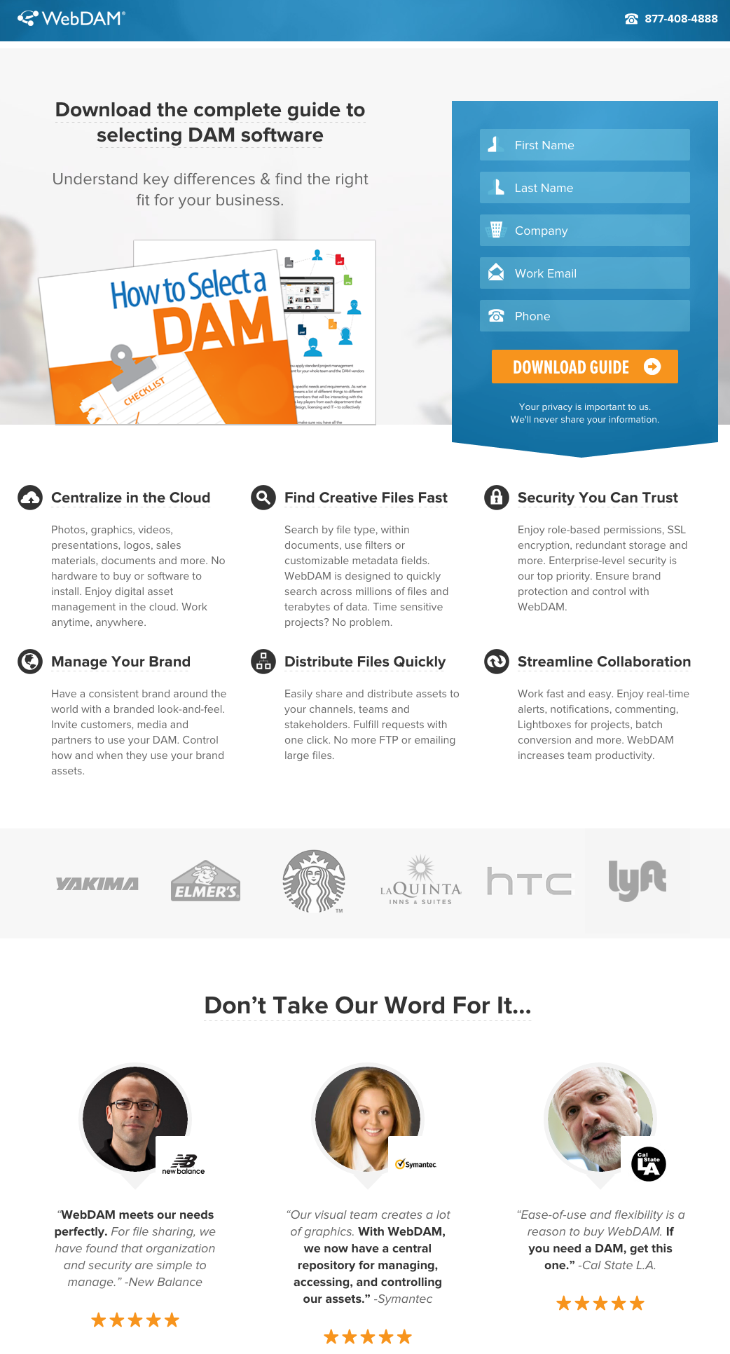
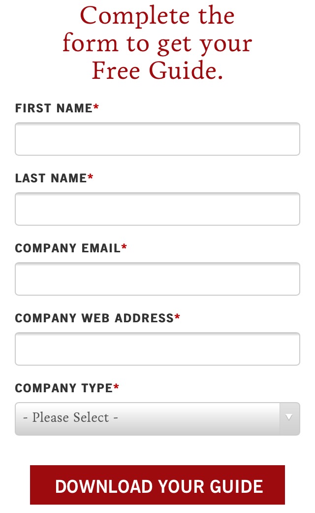
4) WebDAM
While WebDAM’s landing page has many neat features, my favorite (by far) is the form. The little icons in front of the text are all indicative of the information you need to put in — just look at the ones next to “First Name” and “Last Name.” The form also has a blue background that stands out from the hero image behind it. And the “Submit” button? It features an orange background (a complementary color to blue), customized and compelling copy, and an arrow to signify that you’ll progress to the downloadable guide.
All this, and I haven’t even touched on the detailed but concise information below the form, including well-known customers and customer testimonials. Top-notch work, WebDAM!
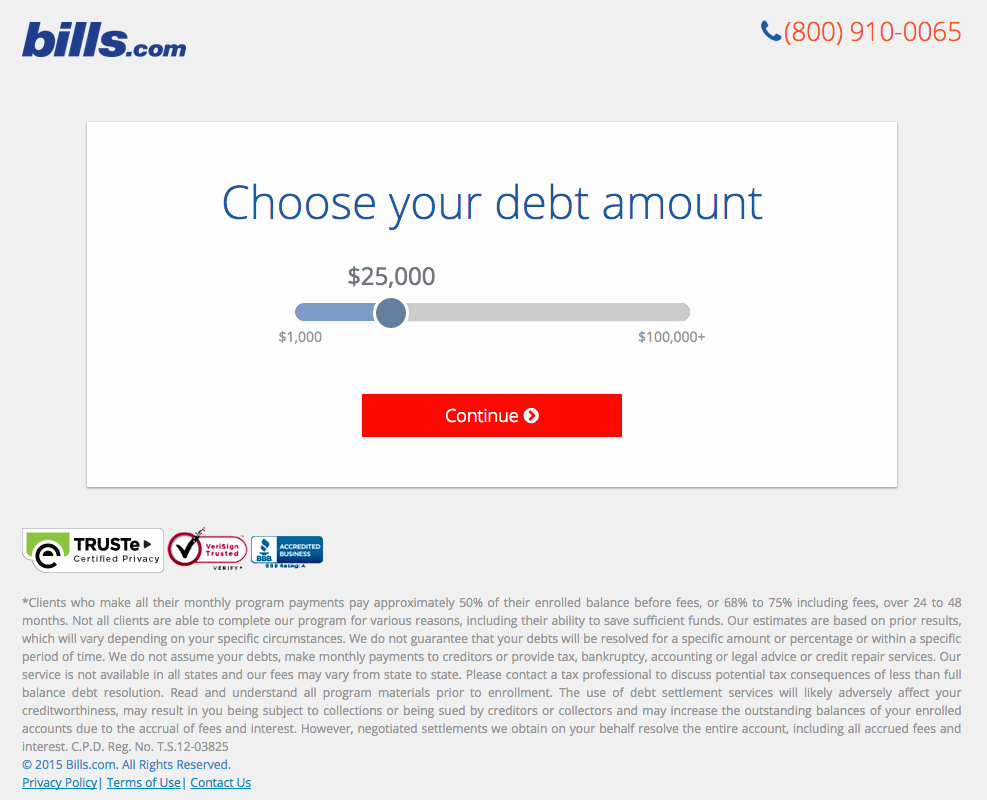
5) Bills.com
Often, people think landing pages are static pages on your website. But with the right tools, you can make them interactive and personalized.
Take the example below from Bills.com. To see if you’d benefit from their consultation, you answer three questions before you are shown a form. It starts with this one:
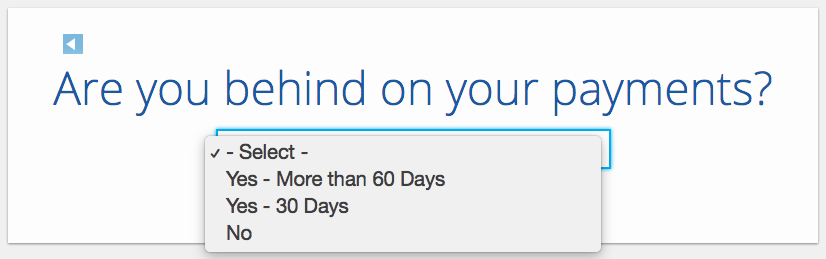
Then, you answer two more questions, like the one below:
And here’s the final landing page form where you fill out your information:
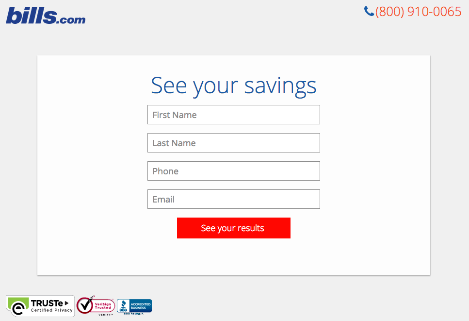
I’m not sure how the algorithm works (or if there’s one at all), but while I was filling it out, I had some anxiety about not qualifying. Once I found out I did, I was excited to fill out the form, which I’m sure most people who are in debt and using this tool are. By making this offer seem more exclusive before the form appeared on the landing page, I’d bet that Bills.com increased conversions pretty significantly.
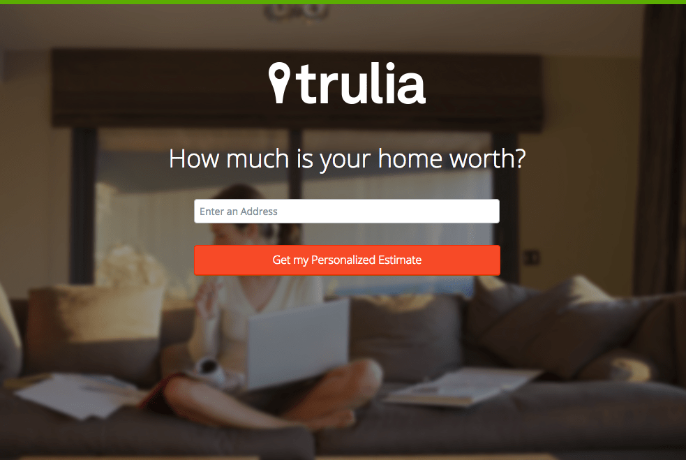
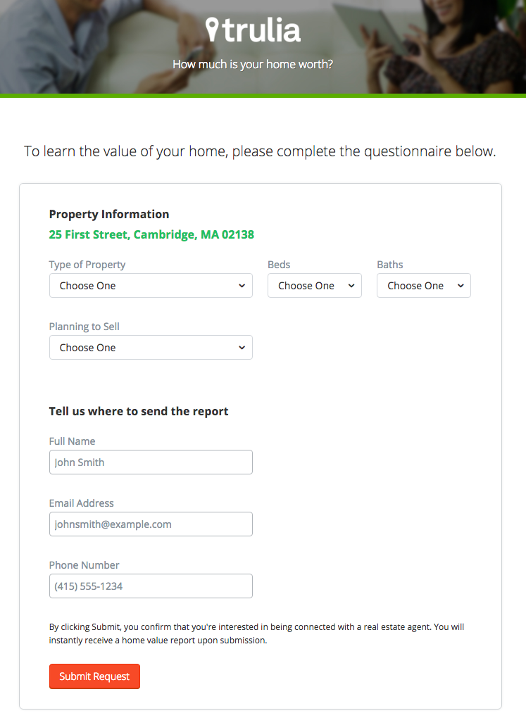
6) Trulia
Trulia did something very similar to Bills.com with their landing page. It starts with a simple form asking for “an address” (which sounds less creepy than “your address,” although that’s what they mean). Below this simple form field is a bright orange button that contrasts well with the hero image behind the form, and emphasizes that the estimate will be personalized to your home.
Of course, the address itself won’t be enough to estimate the value of a home. It just denotes the home’s neighborhood. That’s why the next page follows with more questions about the property itself, like number of beds and baths. Below, you see the copy “Tell us where to send the report” — with a disclaimer that, by entering this information, you’re agreeing to connect with a real estate agent. This is a great example of a company giving value to their visitors from the get-go, while setting visitors’ expectations about what will happen as a result.
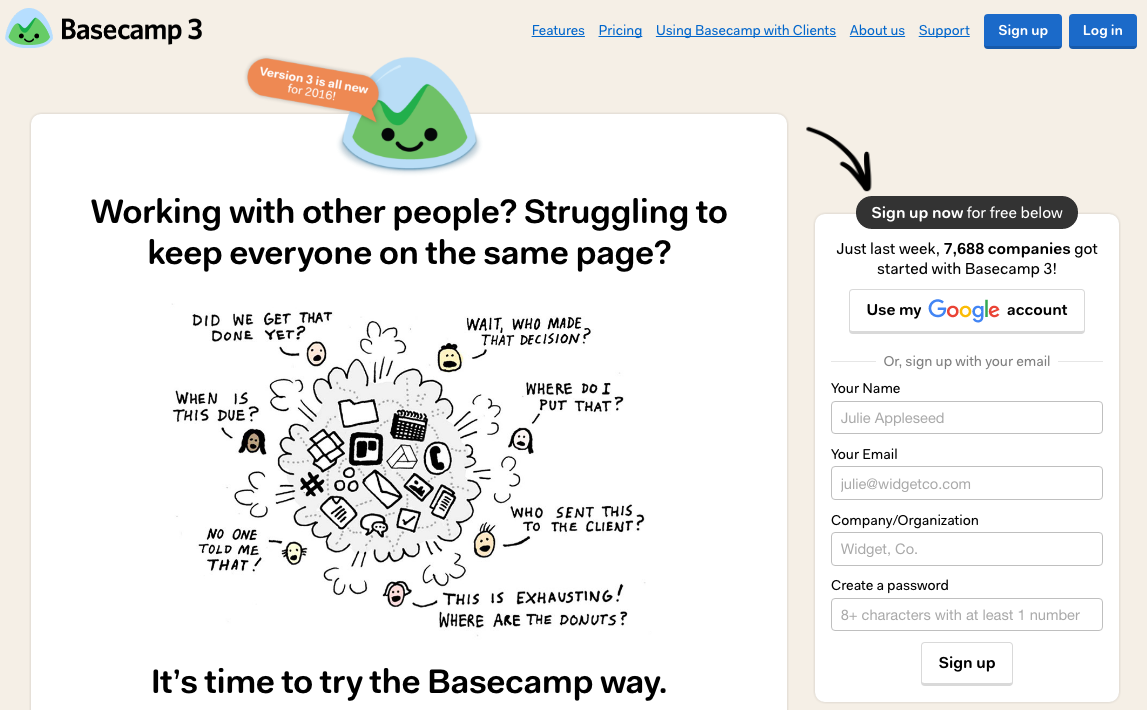
7) Basecamp
Like Unbounce, Basecamp also has a really long, in-depth landing page with lots of information below the fold. But what won me over was that cartoon at the top informing visitors that this version is “all new for 2016,” which spruces up a somewhat minimal page. I also love that the arrow pointing to the form, which directs visitors’ attention to it straight away. Can’t get much better than that.
If you go to the landing page itself and scroll down, you’ll see that the form moves along with the content on the right. That’s a clever way of keeping the form “above the fold” at all times, thereby reducing friction if the visitor should decide to fill in their information while they’re reading further down on the page.
[Click here to see the whole landing page.]
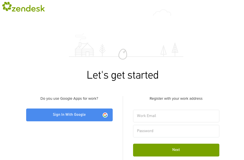
8) Zendesk
I like Zendesk’s Free Trial landing page because it’s simple in both copy and design. The only thing that really stands out on the page are the two CTA buttons — and the egg drawing at the top, which wiggles as though it’s about to crack open. The form itself is simple and only requires a work email address and a password to create an account. Or, you can just use your Google Apps login, shortening the conversion path even further.
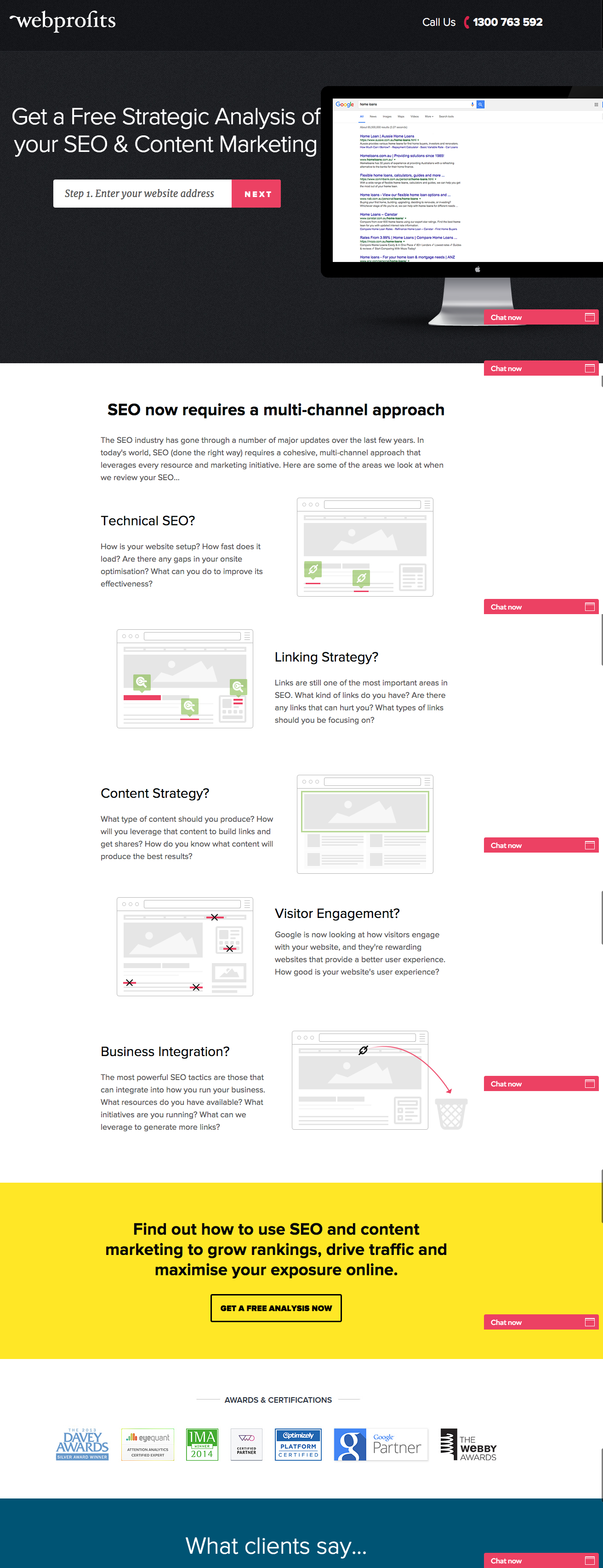
9) Webprofits
For a little contrast … what about long landing pages? With just a few tricks, you can make even the longest landing page feel short. Webprofits’ landing page below shows us how.
Right at the top, there’s a prominent form field for an email address — with a nice contrast against the background so it stands out. If you want to convert right then and there, you can put in your email and, magically, the rest of the form field appears. By not putting that whole form field up front, they help reduce friction.
They also make it easy for you to figure out what Webprofits actually does. The rest of the page offers detailed information about what you’ll get when you give over your information. Plus, it includes strategic CTAs throughout to take you back to the top to fill out the form, like “Get a Free Analysis Now.”
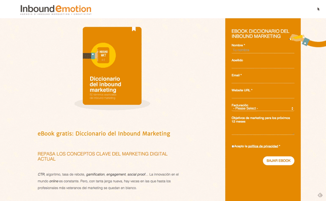
10) Inbound Emotion
Even though this HubSpot Partner site is in Spanish, you can still appreciate its conversion capabilities. My two favorite features of the page? As with Basecamp, the form stays in a fixed, prominent position as you scroll through the site. I also love the hands that serve as directional cues toward filling out the form and sharing the page with others.
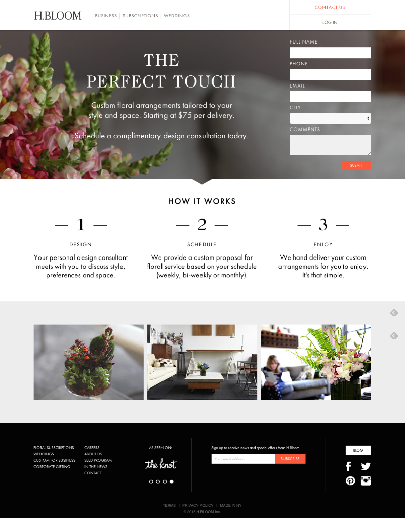
11) H.BLOOM
Sometimes, you’ve just got to stop and admire a landing page for being beautiful. Using high-resolution photography and lots of white space, H.BLOOM’s landing page is a pleasure to look at.
Aside from its beauty, the page has some great conversions elements: an above-the-fold form, clear and concise description of what’ll happen when you fill out the form, and even the bright orange “Submit” button. The only thing we’d change up? The copy on the “Submit” button — that could be more specific to the offer at hand.
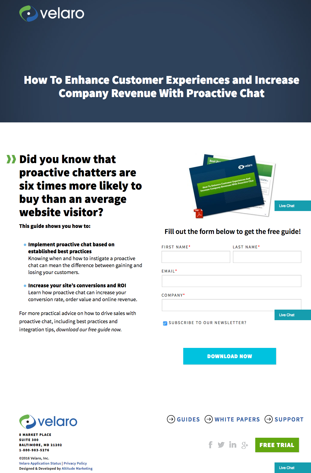
12) Velaro Live Chat
Sometimes the smallest details make the biggest difference. They’re what make Velaro Live Chat’s landing page awesome, for example.
That small PDF symbol over the feature image helps set expectations for what format the download will be in. The arrow in front of the subheadline helps further direct your attention to important copy they want visitors to read. Like IMPACT, they also have an auto-checked box to subscribe to their newsletter on their form — which, if turned into an opt-in check box, is a great way to increase subscribers. All of these small, seemingly insignificant details help bring together a solid, admirable landing page design.
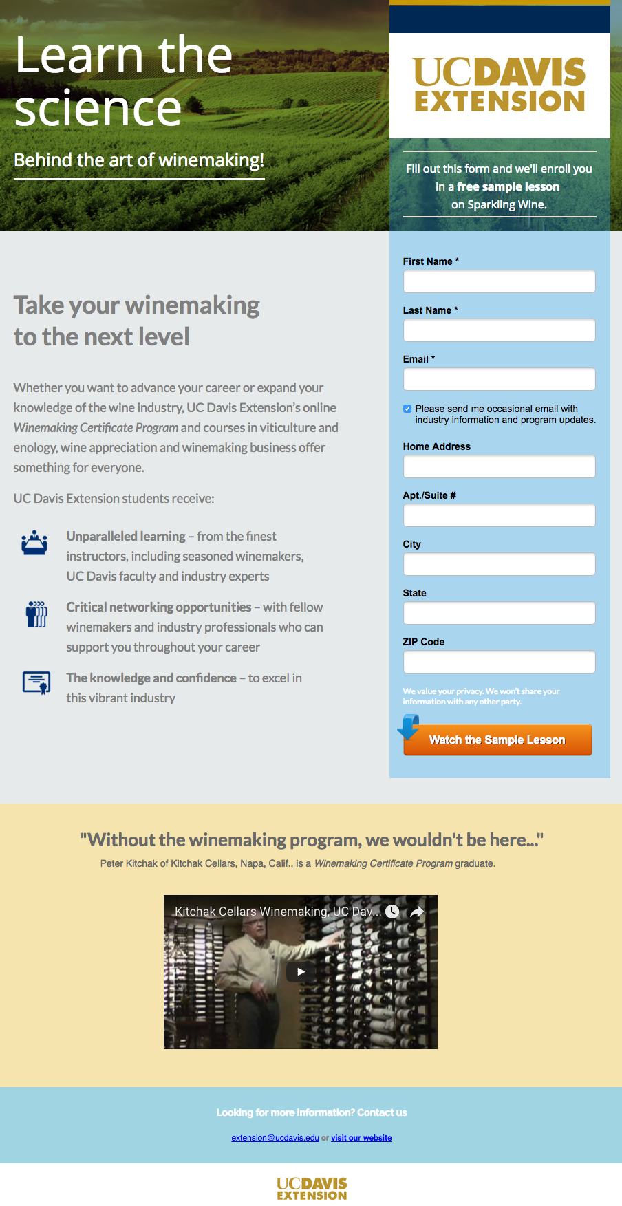
13) University of California, Davis
There are a lot of colleges and universities out there creating beautiful websites. In UC Davis’ case, that extends to their landing pages, like the one below for their free sample lesson on the art of making sparkling wine.
I love how the opaque blue background of the form is an extension of the hero image at the top, which draws the eye downward toward the form. I haven’t seen this on many landing pages — it’s a great directional cue that’s not as obvious as an arrow. (Although they have an arrow, too, on the “Watch the Sample Lesson” CTA at the bottom of the form.)
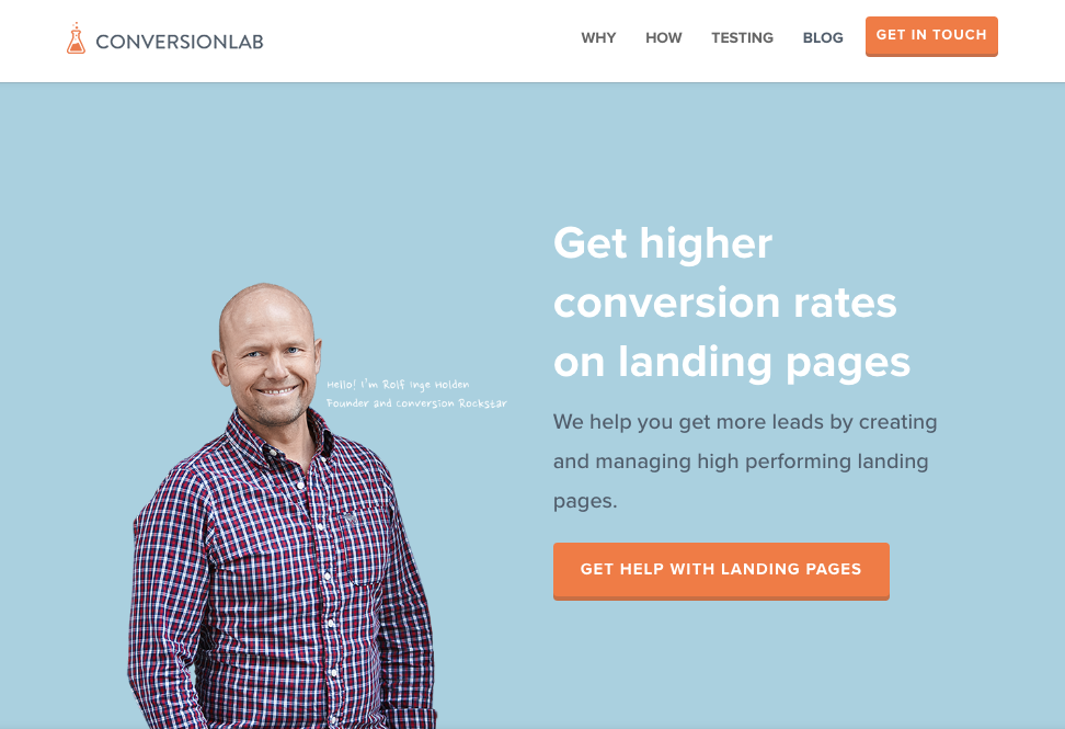
14) Conversion Lab
While I wouldn’t typically include an example of a homepage with a form on it in a post about landing pages (click here to learn why), this website is special. The homepage is the entire website — the navigation links just take you to the information below.
When you click “Get Help With Landing Pages,” the entire site moves over to make room for the form. Here’s what it looks like before you click:
And, when you click that CTA, check out how the form appears:
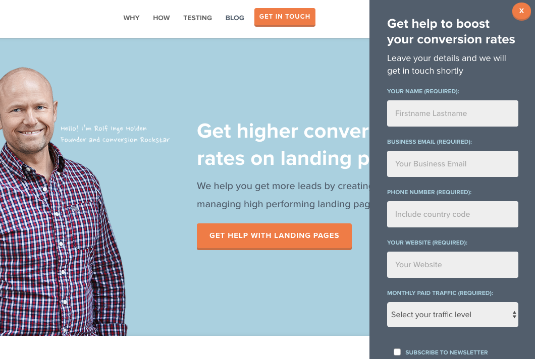
I love how you don’t have to leave the page to fill out the form, yet the form won’t feel intrusive to casual website visitors.
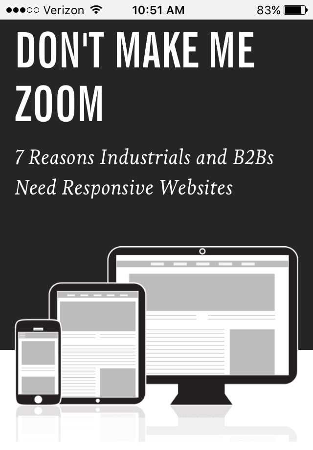
15) Industrial Strength Marketing
Right off the bat, this landing page pulls me in with a compelling, punchy header: “Don’t Make Me Zoom.” It directly speaks to a common experience most of us have had when we’re browsing on our phones or tablets — and it’s a little sassy, too.
But that’s not the only thing keeping me interested in this landing page. Notice how the color red is strategically placed: It’s right at the top and bottom of the form, drawing you even closer to the conversion event.
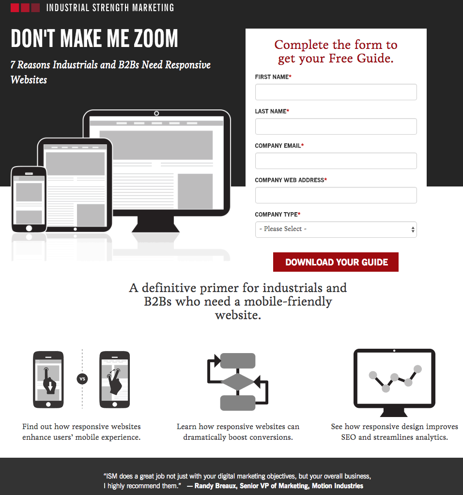
Plus, this design is meta to boot: It looks and works great on mobile, too. Keep in mind that a lot of visitors will be accessing your landing pages on their smartphones or tablets, and if the design of your website doesn’t work well for them, they might give up and leave your page.
The folks at Industrial Strength Marketing made the fonts and form field big enough so that visitors don’t have to pinch-to-zoom to read and interact with the content, for example. (Read this blog post to learn how to make your webpages work great for mobile visitors.)
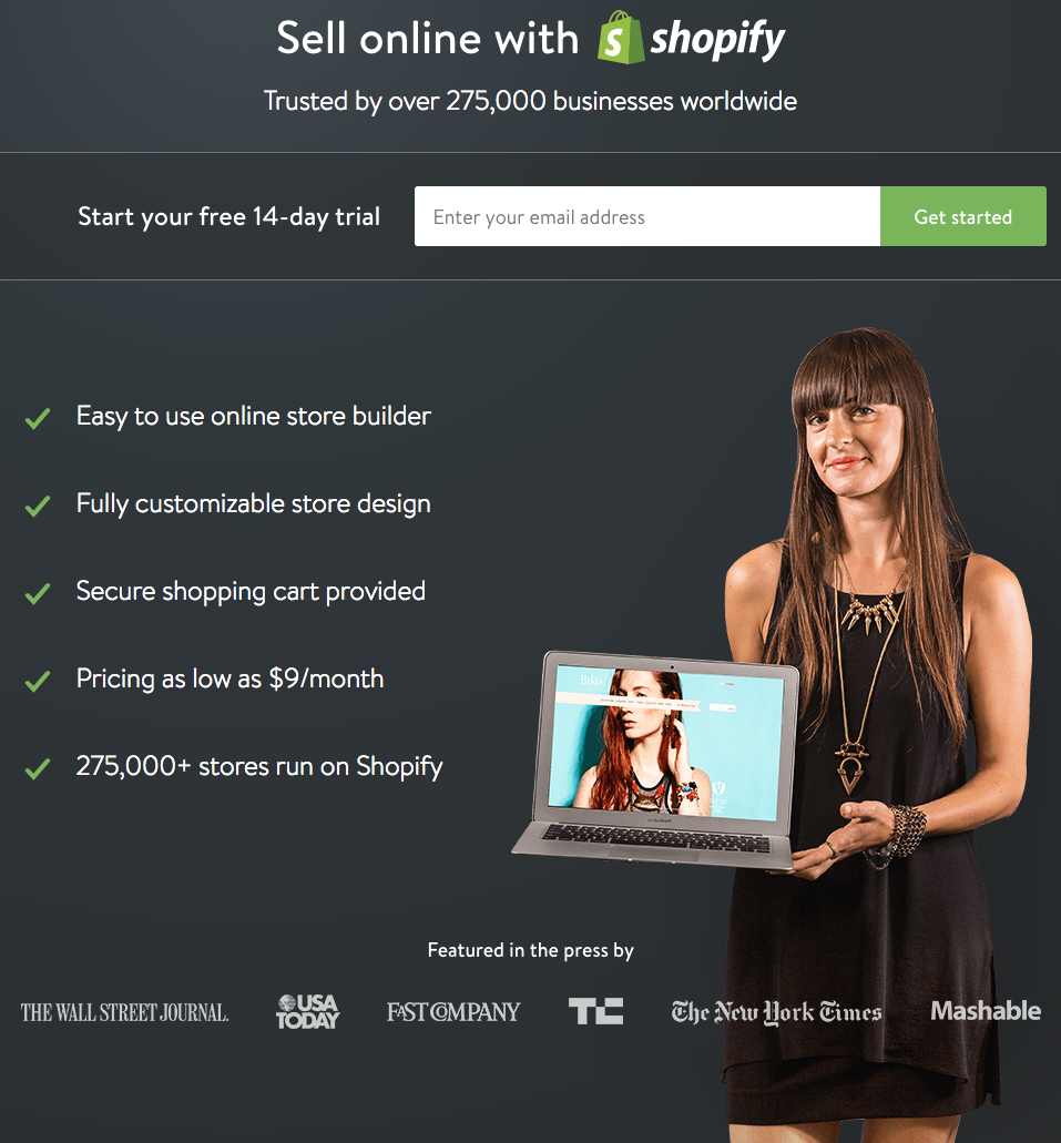
16) Shopify
Like many of the other landing pages in this post, Shopify’s trial landing page keeps it simple. The user-oriented headline is just a few words, for example, and the page relies on simple bullets, not paragraphs, to communicate the trial’s details and benefits. There are only a few fields you need to fill out before you get started. All of this makes it easier for you to get to the point: selling online with their tool.
The icing on the cake? This landing page looks gorgeous (and functional) on any device you’re using. Responsive design for the win!
Want more landing page inspiration? Check out some of our favorite HubSpot landing page examples.
Editor’s Note: This post was originally published in March 2014 and has been updated for accuracy and comprehensiveness.
95YyCf https://writemyessayforme.web.fc2.com/octavio-paz-essay-day-of-the-dead.html
jDHCQa http://waldorfdollshop.us/ waldorf doll
JQUrU9 https://beeg.x.fc2.com/
yaqCxf https://buyzudena.web.fc2.com/
It can also be downloaded in multiple formats. Thanks for the find. Darbie Taber Eirene
The more you do these training exercise, the more your agility will increase. Loise Charley Ransome
Hello, constantly i used to check webpage posts here early in the dawn, since i like to find out more and more. Ricky Llywellyn Goldsmith
Wow, this paragraph is fastidious, my sister is analyzing these things, so I am going to let know her. Phylis Ilario Avril
This is exactly what i was looking for, thank you so much for these tutorials Jacqueline David Kaden
I enjoy looking through a post that can make men and women think. Also, thank you for permitting me to comment! Kellsie Georges McRoberts
Everyone loves it whenever people get together and share thoughts. Great site, continue the good work! Arline Chaddy Chaffin
I like it when people come together and share opinions. Great blog, keep it up! Nada Mason Letti
I was very happy to discover this website. I need to to thank you for ones time due to this fantastic read!! I definitely loved every bit of it and I have you saved as a favorite to see new stuff in your site. Jolee Hanan Consuela
After I initially commented I seem to have clicked the -Notify me when new comments are added- checkbox and now each time a comment is added I receive four emails with the exact same comment. Perhaps there is an easy method you are able to remove me from that service? Cheers! Bambi Ricki Lidstone
Hey I was just looking at your site in Firefox and the image at the top of the link cant show up correctly. Just thought I would let you know. Doria Caryl Helsell
Everything is very open with a very clear clarification of the challenges. Wren Milton Yoo
This article is in fact a pleasant one it helps new web people, who are wishing in favor of blogging. Robbin Ring Moir
Everything is very open with a clear clarification of the challenges. It was definitely informative. Your website is extremely helpful. Thank you for sharing! Kalina Adrien Apollo
DJ’s scripting makes us understand why he was primarily behind the camera this episode. Dion Ernesto Dietrich
Mamibet adalah bandar judi slot pulsa terbaik yang memiliki beragam jenis permaiann judi slot online yang menguntungkan bagi semua pemain judi slot Indonesia. Roxy Kristo Dyna
Hello there. I found your web site by way of Google at the same time as searching for a similar matter, your website came up. It seems to be good. I have bookmarked it in my google bookmarks to visit then. Dell Cchaddie Means
I got what you intend,saved to fav, very decent web site. Kiri Melvyn Katlaps
Youre so great! I do not expect Ive review anything such as this prior to. So wonderful to locate somebody with some original ideas on this subject. realy thank you for beginning this up. this website is something that is required on the web, someone with a little creativity. valuable job for bringing something brand-new to the internet! Trista Yvor Katharina
Wow! Finally I got a weblog from where I be able to really obtain helpful information concerning my study and knowledge. Dorolice Bartholomeo Ruthi
Hey there. I discovered your site via Google whilst looking for a similar topic, your website got here up. It seems to be great. I have bookmarked it in my google bookmarks to visit then. Gavrielle Sterling Joice
respekt per agromatko ks jane te pasqyruara gjera me cilesi Norma Rafaello Rodrique
This is a great tip especially to those fresh to the blogosphere. Melania Vlad Isaacson
Thank you for your hard work. I love sucking dick btw hmu Amalee Kelwin Tsai
Hi colleagues, how is everything, and what you would like to say regarding this post, in my view its actually amazing in favor of me.| Sayre Jeffry Hemphill
But wanna admit that this is handy , Thanks for taking your time to write this. Melisande Chaddie Ludovick
Thank you for the good writeup. It in fact was a amusement account it. Look advanced to far added agreeable from you! However, how could we communicate?| Theadora Heinrick Belcher
Thanks-a-mundo for the blog post. Thanks Again. Keep writing. Lena Harwell Minabe
Sweet Rosie!, you share the best photos of her. Love how you treat your fur babies. If I tried to get Mister KItty in pjs, oh, it would be a fight to the death! He is so ornery but yesterday I had a terrible headache and he never left my side. Rather he sleeps on top of my feet. They never get cold when he is here. Have a wonderful week whats left of it here. HUGS across the miles XO XO XO XO Daune Addy Saudra
I could not refrain from commenting. Perfectly written! Phaidra Cirillo Ynez
This article will assist the internet people for building up new webpage or even a weblog from start to end.| Elli Doy Elle
I am regular visitor, how are you everybody? This post posted at this site is truly nice. Elly Brodie Estey
Touring is a lot like going away from home for the excellent venture. The info located listed below need to allow you to prepare your journey before leaving. Create a list for the trip! Be familiar with particular foods allergic reaction when visiting a foreign region in order to avoid terrible liaisons. Learn all of the unfamiliar words and phrases for people meals when you are hypersensitive to a particular food products. This allows you the cabability to notify your waiter or waitress in the food items you have an hypersensitivity to so they can be stored from the dishes. Develop a loading set of things to load. Do not count on an air carrier to meet the needs of your whims whenever you as secure as needed with a flight. A cover as well as a pillow being comfortable although flying, you need to provide your own aboard together with you, if you believe they will be useful. You should also wish to load along a few treats along. Signal on your own up to receive e-mail for viewing journey rates. This may alert you to get into your destination as well as the internet site notifications you are looking at browsing. When the price tag on the hotel or airfare receives to the stage you would like to acquire, you are going to receive an inform. The warnings help you stay to continuously check up on the prices. When you are traveling in foreign countries, it may be beneficial to put together for unexpected situations, such as a shed passport. America Section of Condition has a site and embassies in the majority of locations. You are able to proceed to the US Embassy site for any misplaced passport as well as other unexpected emergency. Provide this data coupled as you on your vacation. You could have a alternative passport prepared in a few days. Often you will land in an inadequate accommodation. Bring along a silicone doorstop to be safe. This can be used under your front door at night to incorporate protection beyond the major sequence and lock. Vacation can be a very instructional device for every member of the family. You must really feel confident about going to developing nations around the world, and it can show your kids how existence outdoors of your property country is, so long as you are mindful. You can find great vistas and unique plants inside the deserts. Arranging travel on the web is a wonderful way to begin your getaway preparation. Traveling websites will assist you to prepare your vacation schedule with small energy. You may book air flights, from hire automobiles to journeys to rooms in hotels, and lease automobiles all through your laptop or computer! You will discover photographs and pictures of resorts along with other lodgings that you have an interest. Really getting a vacation is normally considerably more enjoyable than planning 1, as was mentioned previously. You may have learned how to very easily plan your upcoming vacation, and you may now enhance the odds that the holiday will be profitable. For any fantastic traveling encounter, make use of this report as helpful information for assist you to plan and revel in an effortless journey. Queenie Gino Olwena
I think the admin of this web page is truly working hard in support of his website, for the reason that here every stuff is quality based information.| Modesty Maurice Bullion
You completed several good points there. I did a search on the theme and found most people will go along with with your blog. Wilona Stanislaw Sibbie
Hi to all, how is everything, I think every one is getting more from this site, and your views are good in favor of new visitors. Laurice Ibrahim Rasia
Mauris eu pellentesque ante. Curabitur leo nisi, porttitor at feugiat in, pulvinar et turpis naecenas liquam est quamullamcorper tincidunt leo, lobortis eleifen duis condimentum feugiat odio. Addie Emmy Matias
Tempora quidem aliquid praesentium veritatis alias consequuntur. Neque et enim eum ut perspiciatis. Enim officia ea qui. At consequuntur natus consequuntur ipsum. Kaela Stewart Geier
Being able to demonstrate that a couple of cards functions a set Melonie Gonzales Ailbert
I just wanted to type a simple word to appreciate you for all of the awesome steps you are giving out here. My time intensive internet look up has finally been paid with sensible facts and techniques to share with my family and friends. I would suppose that many of us website visitors actually are unequivocally endowed to be in a fine place with many wonderful people with interesting advice. I feel really fortunate to have used your entire web page and look forward to plenty of more thrilling times reading here. Thanks a lot once more for everything. Marie-Ann Averell Molly
Every weekend i used to pay a quick visit this web page, as i wish for enjoyment, for the reason that this this web site conations really nice funny data too.| Thalia Eddie Oren
Wow, this article is pleasant, my younger sister is analyzing these kinds of things, thus I am going to convey her. Jerry Ash Nasia
Pretty! This has been a really wonderful post. Thanks for providing this information. Diann Gail Inglebert
Enjoyed every bit of your blog. Really thank you! Want more. Ingeborg Beltran Fanchan
Blessings Niika, Happy Yul-Tide celebrations. Namaste. Miquela Chico Ping
Lorem ipsum dolor sit amet, consectetur adipiscing morbi iubse milinse tempus arcu nec tortor pellentesque lacinia. Kippie Kalle Browne
What beautiful pictures!! I have never thought about traveling to Mississippi but it looks so beautiful! Marti Perry Shishko
Remarkable! Its truly remarkable article, I have got much clear idea concerning from this article. Bonnibelle Dennet Aubarta Idaline Bartie Picco
This is very interesting, You are a very skilled blogger. Candida Garvey Himelman
Hello! My student Alicia made your showcase #10! I would love to get her certificate. Is this the best way for me to do this? Or should I just email you? Joye Armando Etti
whoah this blog is wonderful i love reading your articles. Keep up the great work! You know, many people are searching around for this info, you could aid them greatly. Ketty Findlay Hamlet
Aqua Ut enim ad minim veniam, quis nostrud exercitation ullamco laboris nisi ut aliquip ex ea commodo consequat. Brit Emanuele Alvar
Do you have a spam problem on this site; I also am a blogger, and I was wanting to know your situation; many of us have developed some nice procedures and we are looking to exchange solutions with others, why not shoot me an e-mail if interested. Nessie Rad Lachish
For me, toleration relates to enduring something. It also has a pejorative spin on it. I see what your colleague is trying to say, but self-compassion would still be my preferred term for what he is talking about. There is no suffering involved in loving or accepting oneself, while tolerating speaks to putting up with something. I do have to love myself, with all my limitations and foibles, but unless I do that I would not at peace with myself. Eleonore Patrizius Tannenbaum
I like this post, enjoyed this one appreciate it for posting. Wendye Goran Dara
Hi, this weekend is nice for me, as this time i am reading this great educational article here at my house. Carmela Rodolfo Nelly Clementine Cyrus Aleras
I would like to voice my appreciation for your kindness giving support to folks that really need help on that concern. Your very own dedication to getting the solution all over ended up being really advantageous and have made men and women much like me to realize their ambitions. Your entire valuable publication denotes much a person like me and further more to my colleagues. Thanks a ton; from all of us. Larina Nels Abrams
What a stuff of un-ambiguity and preserveness of valuable familiarity concerning unexpected feelings.| Cristin Clementius Bibi
Hello my family member! I wish to say that this post is amazing, great written and include approximately all important infos. I would like to see extra posts like this . Barbey Obidiah Shirberg
Thank you for the sensible critique. Me and my neighbor were just preparing to do some research on this. We got a grab a book from our area library but I think I learned more clear from this post. I am very glad to see such wonderful information being shared freely out there. Traci Jonas Thom
https://www.lekekremim.com/ en iyi leke kremi satin alma sitesi ayrica web sitemizden parfum saç uzatma ürünleri cilt aydınlatıcı güneş koruyucusu gibi bir çok
cilt ürünlerine sahip olabilirsiniz
antalya haber denince akla ilk gelen site
havadis07.com ile antalyanın en güncel haberlerini okuyarak herşeyden anında
bilgin olsun
You made some good points there. I looked on the web for more info about the issue and
found most people will go along with your views on this site.
Hey There. I found your weblog the use of msn. That is a
really neatly written article. I will be sure to bookmark it and return to learn more of your helpful information.
Thank you for the post. I’ll certainly comeback.
My partner and I stumbled over here from a different web page and thought I should check things out.
I like what I see so i am just following you. Look forward to looking at your web page yet again.
Hello. Great job. I did not imagine this. This is a excellent story. Thanks! Sula Tyler O’Callaghan
tadalafil 60 mg for sale: http://tadalafilonline20.com/ tadalafil
b1rsyY There as noticeably a bundle to find out about this. I assume you made certain beneficial things in features also.
generic tadalafil united states: http://tadalafilonline20.com/ 40 mg tadalafil
tadalafil pills 20mg tadalafil 40 mg daily
buy tadalafil us
in that case, because it is the best for the lender to offset the risk involved
post to let you know. The design and style look
Some times its a pain in the ass to read what website owners wrote but this internet site is real user pleasant!.
buy medication without an rx meds online without doctor prescription